


Day 1: Type Design, short course, Reading University.
Over the next two weeks I’ll be studying type design at the well regarded Department of Typography and Graphic Communication at Reading University. I join a small class of 14 designers that have come from all over the world to study this condensed and selective version of the world-class MA programme.
It’s been referred to a “boot-camp for the brain” and today our first day was definitely a rigorous and intensive introduction to the subject.
After the welcome and orientation we kick off:
- 09:30 - 13:00 – Latin type and typography development
- 14:00 - 15:30 – Non-Latin letterforms
- 15:30 - 16:30 – Introduction to designing non-Lating scripts
- 17:00 - 18:00 – Evening Lecture: W. A. Dwiggins
The jam-packed morning session was run by Gerry Leonidas and the well know Dutch typeface designer Gerard Unger. We strode through the history of type and printing from 15th Century to the 20th.
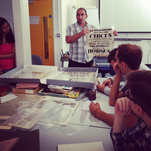
For each small step we handled corresponding material from the amazing archives; hand-written and beautifully decorated manuscripts, hybrids of type and drop caps, early books, the first newspapers, public notices and posters. We progressed methodically up to type specimens of the last 50 years and ended with first editions of Émigré, Eye and Octavo magazines, taking us up to today’s specimens and printed examples.
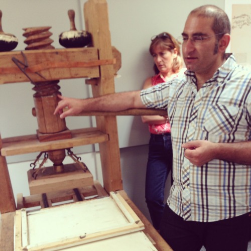
We toured the building to examine the progressive technology for producing and printing type: punches, matrices and moulds for producing moveable type. We looked at several presses and finished with a Monotype machine. We discussed the forces driving these changes; economics, public demand, and need for efficiency constantly pushing the technology forward. With each major jump in technology however, we see it being used to mimic what was done before, repeatedly harking back to similar typographic structures and principles.
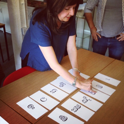
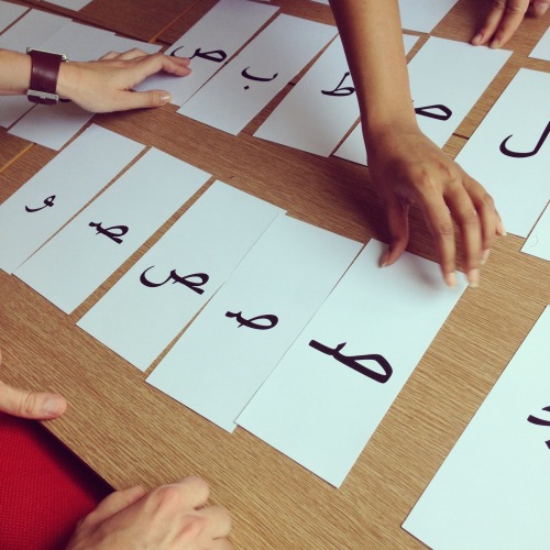
The afternoon sessions were equally captivating. Fiona Ross introduced us to type design of non-Latin scripts. First, two long tables were covered with a mix of printed Indian characters, one table with Northern and the other, Southern. We were asked to match which characters that we thought belonged to the same script, these included Devanagari, Bengali, Gajarati, Telugu, Gurmukhi and more. The aim is to move you away from thinking and looking with a ‘Latin eye’ and to gain an appreciation for the forms in their own right. We then repeated this excursive with Arabic scripts.
After a quick break we ran through the basic principles for designing these scripts, looking at the their heritage and discussing ‘consonant clusters’, ‘host characters’ for post scripts and solutions for common problems like spacing and extra large characters.
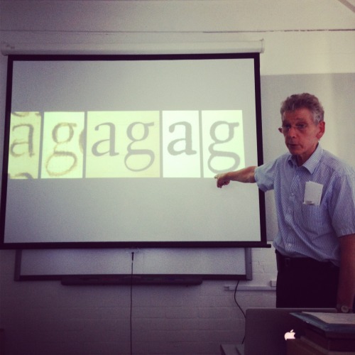
Back with Gerry, we look through more type specimens and the stories they tell. We discuss the market for typefaces, display and text markets and – the need for a good idea!
Evening Lecture: We finish with an energetic and insightful lecture from Gerard Unger on W. A. Dwiggins and his work. We are told that Dwiggins provides many of the answers to Type Face design, both with his ability to take inspiration from unusual places and his original concepts and methods. We look at his first typefaces and how his production of marionette dolls leads him to the notion of accentuated features for small type. We finish with a small exhibition of his work in print.
It was a long day but I’m looking forward to more…
Read the other reports in this series: