


Abstract
With increasing frequency, patients are being asked to make complex decisions about cancer screening, prevention, and treatment. These decisions are fraught with emotion and cognitive difficulty simultaneously. Many Americans have low numeracy skills making the cognitive demands even greater whenever, as is often the case, patients are presented with risk statistics and asked to make comparisons between the risks and benefits of multiple options and to make informed medical decisions. In this commentary, we highlight 10 methods that have been empirically shown to improve patients’ understanding of risk and benefit information and/or their decision making. The methods range from presenting absolute risks using frequencies (rather than presenting relative risks) to using a risk format that clarifies how treatment changes risks from preexisting baseline levels to using plain language. We then provide recommendations for how health-care providers and health educators can best to communicate this complex medical information to patients, including using plain language, pictographs, and absolute risks instead of relative risks.
Every day, oncologists and their patients are confronted with difficult decisions about what type of treatment patients should receive. For example, breast cancer patients must first decide on what type of surgery to undergo and then whether to undergo adjuvant therapies such as chemotherapy and hormonal therapy. Early-stage prostate cancer patients must decide between active surveillance, radical prostatectomy, and radiation (external beam or brachytherapy). Those diagnosed with thyroid cancer must decide whether to have radioactive iodine therapy. These types of decisions are “preference sensitive,” meaning that the “right” treatment depends on a given patient’s preferences—on the relative weight the patient gives to the risks and benefits of the treatment ( 1 , 2 ). However, for patients to make trade-offs between risks and benefits, they must first understand the risks and benefits of treatments. Thus, to ensure that oncology is practiced at its best, oncologists must use effective means of communicating this information to their patients.
Yet, patients often have difficulty understanding the types of health information required for such decisions. First, they often lack the health literacy needed to understand the words that their doctors use when describing medical alternatives. Patients even have difficulty comprehending many of the educational materials they receive from health providers. Although an average American reads at eighth grade reading level ( 3 ), health education materials are often written at a high school or college reading level, making the information contained in them inaccessible to the targeted audience ( 4 ).
Second, many patients have low numeracy skills, leaving them less able to derive useful meaning from the numerical information often presented in such materials (eg, risk and benefit statistics) ( 5 ). To put the issues of low numeracy into perspective, approximately half of the adults in the United States are unable to accurately calculate a tip ( 3 ), and 20% of college-educated adults do not know what is a higher risk—1%, 5%, or 10% ( 5 ). Thus, when an oncologist tells a patient that his or her 5-year chance of survival is 85% or if an educational pamphlet informs patients that the risk of nausea from chemotherapy is 55%, many patients will not understand such statistics well enough to use them as part of making an informed decision.
In this article, we highlight 10 methods that have received empirical support for improving patients’ understanding of risk and benefit information and/or their decision making and provide recommendations for how best to communicate complex information to patients (see Box 1 ). Our discussion focuses on methods that we believe are particularly relevant for decision support and is not a systematic review of the relevant literature. Although most of the cited research in risk communication methods has been conducted in the context of patient education materials, the same principles should apply when physicians discuss treatment options with patients.
Use plain language to make written and verbal materials more understandable.
Present data using absolute risks.
Present information in pictographs if you are going to include graphs.
Present data using frequencies.
Use an incremental risk format to highlight how treatment changes risks from preexisting baseline levels.
Be aware that the order in which risks and benefits are presented can affect risk perceptions.
Consider using summary tables that include all of the risks and benefits for each treatment option.
Recognize that comparative risk information (eg, what the average person’s risk is) is persuasive and not just informative.
Consider presenting only the information that is most critical to the patients’ decision making, even at the expense of completeness.
Repeatedly draw patients’ attention to the time interval over which a risk occurs.
The risk communication methods described here focus on how to communicate information when there are high-quality evidence-based statistics relevant to the decision at hand. Presenting patients with this type of information is especially critical when patients are confronting “preference sensitive decisions” ( 6 ), meaning that the choice involves trade-offs (eg, between quality and length of life or between different aspects of quality of life) where the right choice will depend on the importance a patient gives to these trade-offs. The uncertainty that patients commonly feel about such decisions may be decreased by providing quantitative information regarding the risks and benefits of each treatment option. Thus, this article focuses on how to best present relevant data to patients in ways that improve understanding and decrease biased decision making.
It is important to note, however, that we do not address how to present the uncertainty that is inherent in clinical data. In clinical medicine, high-quality data are often scarce or have wide confidence intervals. When data are available, they can be contradictory or have multiple interpretations. Presenting data uncertainty is extremely difficult, and only a very few articles have addressed this issue [see Politi et al. ( 7 ) for a review of this literature]. In fact, in this review article ( 7 ), Politi et al. specifically state “… we know very little about the optimal approaches and outcomes of communicating different types of uncertainty.” This is a highly undeveloped area, and more research is needed before we will know whether it is beneficial to present data uncertainty to patients and, if so, how to best do so.
Risk Communication Strategies That Have Shown Strong Evidence for Improving Patient Understanding and Decision Making
The risk communication strategies we discuss in the following section (“Recommendations 1–3”) have been tested in many studies and have shown strong evidence for improved patient understanding and decision making. Thus, we feel confident about making strong recommendations for the risk communication methods described in this section. Few, if any, studies have tested whether risk communication methods work differently in men and women, and gender differences have not typically been reported in studies that test risk communication in both women and men. Thus, we have no evidence that suggests that the recommendations would differ by the gender of the reader. Thus, we believe the recommendations apply equally to men and women.
Recommendation 1: Communicate Using “Plain Language”
The practice of cancer education must rise to the challenge of designing and employing communications that use plain language. Plain language generally refers to materials that are written in a simplified manner so that people of low literacy (eighth grade or lower level of education) can read them and process the information. This can be achieved in part through reduction or elimination of clinical and statistical jargon; the use of well-structured, logically sequenced, and focused information; and through the use of graphic design or a page layout that makes the material easier to read (eg, more white space, use of subheadings) ( 8 ). Research has shown that when materials are written in plain language, people understand the content better ( 9 ).
Writing in plain language is a challenge for some, and speaking in plain language can be even more difficult. However, many sources provide practical guidance for using plain language ( 10 , 11 ).
Recommendation 2: Present Statistical Information Using Absolute Risk Rather Than Using Relative Risk or Number Needed to Treat Formats
A common challenge for presenting risk information to patients is how to present the statistical information, particularly in situations when clinicians are trying to describe how a medical intervention decreases the risk of cancer. Consider, for example, risk communication with women who, based on their Gail model score ( 12 ), are at elevated risk of being diagnosed with invasive breast cancer and are eligible to take tamoxifen (or raloxifene if they are postmenopausal) to reduce their primary cancer risk. When describing the risk reduction such women would achieve by taking a chemoprevention drug, clinicians can quantify the risk reduction in multiple ways. They could use relative risk and tell her that her risk of breast cancer would be reduced by 50% if she took the drug. Alternately, they could provide a woman with her absolute risk and tell her that her 5-year risk of breast cancer could be reduced from 4% to 2%. Finally, they could use a “number needed to treat (NNT) format” and tell a woman the number of patients who would need to take a chemoprevention medicine to prevent one diagnosis of invasive breast cancer.
Each of these formats differs in patients’ ability to understand the information and how the information influences their perceptions of risk, as shown by Sheridan et al. ( 13 ). The authors found that NNT was the most difficult format for patients to understand and recommended it never be the sole way information is presented.
Furthermore, research has consistently shown, both in the context of making psychological and medical decisions, that changes in risk appear larger when presented using relative risk than when using an absolute risk ( 14–17 ) and that the treatments were viewed more favorably when presented in terms of relative risk ( 18 ). This use of relative risk information can inappropriately lead patients to believe that a treatment is more effective than what has been empirically proven. Additionally, several studies have found that medical students and practicing physicians were more likely to recommend treatment (eg, chemotherapy) if the information was presented using relative risks (compared with absolute risks or NNT) ( 19 , 20 ). Given these findings, we strongly recommend that risk information be consistently presented to patients using absolute risks.
Recommendation 3: Using Pictographs to Communicate Risk and Benefit Information
Presenting probabilistic information in graphical format, in addition to numerical format, increases people’s understanding and may affect their decision making ( 21 ). However, there are many types of risk graphics (eg, horizontal and vertical bar graphs, pie charts, and pictographs)—so which one to use? Several considerations need to be taken into account ( 22–24 ). For example, the type of statistic being presented (eg, effectiveness of a drug over time vs likelihood of experiencing impotence as a result of treatment) can make certain formats more vs less effective ( 22 , 23 , 25 ). Another consideration is the time frame for which information is presented. For example, if just one number is being presented (ie, presence of side effects for prostate cancer 2 years after treatment), a pictograph (also called image matrix or icon array; see Figure 1 for an example of a pictograph) would be fine. However, it may be more difficult to show change in risk pattern over time with a pictograph compared with a line graph.
![Pictograph format to communicate risk information. Pictograph used in the “Guide to Decide” web-based decision aid [see ( 26 ) and ( 27 ) for details] to highlight the additional risk of cataracts (one of the several side effects of tamoxifen) faced by women taking tamoxifen ( dark blue ) as compared with the baseline risk for women of the same age ( light blue ). Each rectangle represents 1 out of 100 individuals.](https://oup.silverchair-cdn.com/oup/backfile/Content_public/Journal/jnci/103/19/10.1093_jnci_djr318/3/m_jncidjr318f01_4c.jpeg?Expires=1716487049&Signature=Hr36XdVSg-FFV-M6MkrEGfWCqMq4B1~9evrG8GZUzqaF9j52ZrMQUkx40EcmPO~3xweGmx13VG7B64WUIOAffB-~mgpL2RcN9wyxndW55ypnNMf4MxfOSbu0mi~fkdC6qfv0nDmwob6iMyy1-kuCPcjeb9EdHhErbLjOl3BwwVGElztUY7ARsv9C0ToHC2ou~hP4PqFeub42zfBjxUkzr-ba5l7Pj023lQ2hkf7kQV4u7KbqT7AMotbKqBA5N6WpsTNFqAmPssTktSHj~Ss9T-FV~qaAa2KqH1mktdYtncsfogQRz4zPSdBlP4eLP7D7-CQDav9ChR2hG5yY9rKJ3A__&Key-Pair-Id=APKAIE5G5CRDK6RD3PGA)
Pictograph format to communicate risk information. Pictograph used in the “Guide to Decide” web-based decision aid [see ( 26 ) and ( 27 ) for details] to highlight the additional risk of cataracts (one of the several side effects of tamoxifen) faced by women taking tamoxifen ( dark blue ) as compared with the baseline risk for women of the same age ( light blue ). Each rectangle represents 1 out of 100 individuals.
A growing body of research has conclusively shown that when communicating individual statistics, pictographs are more quickly and better comprehended than other graphical formats and can help to prevent patients from being biased by other factors ( 26 , 28–32 ). Part of the appeal of the pictographs is that they visually represent the risk as a frequency rather than a probability while simultaneously conveying both the numerator and the denominator—those affected and those not affected. Pictographs have also been shown to be more effective than pie graphs in communicating verbatim knowledge (ie, the exact number presented in the graph) and more effective than bar graphs (and equally effective as pie graphs) at communicating gist knowledge (ie, the main point of the message but not exact numbers) ( 29 ). Based on this evidence, we give our highest support for the use of such graphics whenever patients must think in depth about statistics.
Risk Communication Strategies That Have Shown Preliminary Evidence for Improving Patient Understanding and Decision Making
Early evidence suggests that the following strategies affect knowledge and decision making. However, the data are preliminary or contradictory, and more research needs to be conducted.
Recommendation 4: Consider the Impact of Presenting Statistical Information Using Frequencies Rather Than Percentages
When presenting information, is it better to present data using frequencies or percentages? Taking another example, when describing the risk of impotence from a radical prostatectomy to prostate cancer patients, urologists could say that 60% of men who undergo a radical prostatectomy experience impotence. Alternatively, urologists could describe this as impotence occurring in 60 out of 100 men. Research has been inconsistent in demonstrating whether people understand risk information better, if risks are presented in frequencies (eg, five out of 100 people experience a side effect) rather than percentages (5% of patients experience a side effect). In some studies, the use of frequencies improved the understanding ( 33 , 34 ), whereas in one study frequencies and percentages showed equivalent understanding among patients ( 35 ).
Regardless of the knowledge differential, the choice between frequencies and percentages can affect how people perceive the risk of treatment. For instance, in the study conducted by Peters et al. ( 36 ) to test whether presenting frequencies or percentages affected people’s perception of risk, participants were asked to imagine that they had severe headaches that required them to miss work. They then read about a medicine that decreased the frequency of headaches. Participants read about the efficacy of the drug and the accompanying side effects either in percentage or frequency formats. For example, the risk of a side effect was described as “10% of patients get a bad blistering rash” or as “10 out of 100 patients get a bad blistering rash.” Lower numeracy participants perceived the medicine as less risky when the information was presented using percentages than when presented in frequencies. This reduction in perceived risk arose only in part because people had difficulty understanding percentages. It also occurred because “10%” feels more abstract to people, and thus less worrisome, than “10 out of 100.”
Finally, people prefer to receive information presented in frequency formats over receiving data using percentages ( 34 ). Given these data, we recommend, though not strongly, that communications about cancer risks and treatment benefits be presented using frequency formats.
Recommendation 5: Highlight the Incremental Risks Associated With Treatment Distinctly From Baseline Risks
When discussing treatment complications or side effects, it is essential that patients can differentiate between baseline risks (risks they would face regardless of an intervention) and risks associated with treatment. For example, one side effect of taking tamoxifen is an increased risk of experiencing hot flashes and vaginal dryness. Yet, postmenopausal women already have an increased risk of these symptoms even if they do not take tamoxifen. If a patient was told that she had a 70% risk of menopausal symptoms if she took tamoxifen, it is likely that she would believe that the drug solely was responsible for the risk and fail to recognize that much of that risk was unrelated to the intervention.
Patients presented with risk communications that only describe the total risk of complications in a treatment group are prone to mistakenly perceive the entire risk as being caused by treatment. One way to prevent this problem is to separate baseline and incremental risk information. For example, an initial pictograph could display the patient’s baseline risk. Once the magnitude of that risk has been absorbed by the patient, a second pictograph could add a new color to represent the additional people who would experience the side effects because of the treatment ( Figure 1 ). We conducted two studies—one an analysis of more than 600 women at high risk of breast cancer who were considering that they were taking tamoxifen for chemoprevention ( 26 ) and a second using a hypothetical scenario and treatment decision ( 37 ) and found that this method reduced worry about the risks of side effects of medication and reduced perceived likeliness of experiencing a side effect. Of note, we also found that to facilitate knowledge, the incremental risk approach must be combined with the use of pictographs ( 26 , 37 ).
Recommendation 6: Be Aware That the Order of Presenting Risks and Benefits Can Alter Risk Perceptions
When describing both risks and benefits to patients, one has to choose whether to begin with the risks or to begin with the benefits—a seemingly mundane choice, except that the choice actually matters. In a recent study of a tamoxifen prophylaxis decision aid, we discovered that when the risks of tamoxifen were presented after the benefits, participants perceived the risks as more worrisome and more common ( 38 ). The risks, by coming last, triggered what behavioral scientists call a “recency effect” ( 39 ). Furthermore, knowledge was higher (as four of six questions were about the risks). These effects occurred even though patients read both sets of information within minutes of each other. Cancer clinicians and educators need to be aware that order of presentation can have a major effect on both patient knowledge and risk perceptions.
This problem of a recency effect may appear to be insurmountable. When explaining treatments to patients, clinicians need to start somewhere, and some piece of information needs to come first and some must come last. Whatever choice a clinician makes, therefore, creates the possibility that patients’ judgments and decisions are being influenced by recency effects.
Nevertheless, this problem can potentially be minimized by taking a moment to briefly review the information for patients. The initial discussion of risks and benefits might be relatively lengthy, as patients grapple with new and frequently unfamiliar information. But a quick summary can help put all this information back into patients’ minds, keeping the early information from receding into the background. Indeed, our next recommendation presents one way to accomplish this goal—by providing patients with a table summarizing the information most relevant to their decisions.
Recommendation 7: When There Are Numerous Risks and Benefits, Conclude With Summary Tables
Many cancer prevention drugs and treatments have numerous risks and benefits associated with them. When presented on multiple pages, or over a lengthy conversation, such information is hard to remember. One option that can facilitate memory, and make it easier for patients to compare alternatives, is to include a summary table at the end of patient materials that concisely reminds patients of the relevant attributes and the risk and benefit statistics. In a recent study, we presented information about five risks and two benefits of tamoxifen and raloxifene to patients considering these medicines for breast cancer chemoprevention ( 27 ). We found that patients who received a summary table were more interested in looking for more information about chemoprevention, talking with their doctor about chemoprevention, and taking tamoxifen or raloxifene than those who did not receive a summary table ( 27 ). However, we did not find substantial differences in gist knowledge (ie, their knowledge regarding whether the medication caused a statistically significant increase or decrease in risk). We recommend including summary tables in any complex patient information materials as a method to reduce the cognitive burden on patients and encourage patient–clinician communication.
Recommendation 8: Recognize That Comparative Risk Information Is Persuasive Not Just Informative
Whenever cancer educators present personal (or tailored) risk data to people who are considering screening or preventive behaviors, a question arises regarding whether to compare the individual’s risk to the absolute risk faced by the “average person” (ie, average risk of the relevant population—an example is the average woman’s risk of breast cancer is 13%). In the literature, this type of information is called “comparative risk” information ( 40 ). Comparative risk information may be helpful to patients because it allows relatively hard to evaluate personal risk statistics to be compared against a meaningful standard ( 41 , 42 ). Without this type of information, it may be difficult for people to know how to feel and react to statistical information ( 43 , 44 ). However, it can also potentially bias decision making by altering how a person interprets his/her own risk.
Comparative risk information has some similarities with relative risk information in which the risk information has a powerful impact on decision making by turning the patient’s attention away from the more informative absolute risk information. It differs from relative risk, however, in both source and presentation format. Comparative risk information involves presenting one or more supplemental absolute risk statistics to highlight differences in risk related to the individual characteristics of the target patient vs relevant populations. These statistics are usually the average risk of the population as a whole or a relevant demographic subset (eg, women or adults older than 60 years) derived from population-based studies. By contrast, relative risk presentations tend to come from clinical trials where there is a natural comparison group (ie, control groups) and translate the observed difference in risk into percentage change in risk or odds ratios, thereby obscuring the level of absolute risk.
There have been several studies that have shown the power of comparative risk perceptions in comparison with people’s absolute risk ( 40 , 45 , 46 ). In these studies, comparative risk was typically a better predictor of worry and behavior ( 40 , 45 , 46 ). However, even within one of these studies ( 45 ), the role of absolute and comparative risk varied. In this study, women’s worry about cancer was best predicted by their absolute risk perceptions rather than by comparative risk perceptions. Furthermore, they found that in people who had already been diagnosed previously with cancer, absolute and comparative risks were equally predictive of cancer worry. These articles ( 40 , 45 , 46 ) suggest that people’s judgments and behaviors are often related to how they view their own risk compared with others. However, much more research is needed to better understand whether or how providing participants with comparative information changes risk perceptions and behavior.
In fact, providing comparative risk information could have harmful effects on decision making. In one study that used a hypothetical vignette ( 47 ), we gave women risk information that made them feel as if they had either a below average risk of breast cancer or a higher than average risk of breast cancer. Participants who were told that they were at higher than average risk of developing breast cancer rated the effectiveness of a preventive medication higher and were more likely to endorse taking the drug than those who were told they had below average risk ( 47 ). We argue that this belief is nonnormative because participants in both groups should have viewed the drugs equally effective as the absolute risk reduction for breast cancer was equivalent for both.
People’s decisions regarding the efficacy of treatments should not be based on how their own risk compares with the risk of someone else. Rather, such decisions should be based on whether the benefits of the intervention outweigh its risks for an individual patient. Comparative risk information is a powerful influence on risk perceptions and can bias decisions, though it is informative. Although this area certainly needs more research, we are currently quite wary about including average risk information in educational materials.
Recommendation 9: Consider That Less Information May Be More Effective
When designing patient education materials, there is an understandable tendency to err on the side of presenting too much information for the sake of comprehensiveness. However, recent studies have shown that presenting more information can be distracting and prevent people from focusing on the key pieces of information that is needed for decision making ( 48–50 ). We ( 50 ) tested this proposition in three recent articles by Zikmund-Fisher et al. ( 49–51 ) using the online decision-making tool Adjuvant! Online ( 52 ), version 8 ( www.adjuvantonline.com ), as a model. Currently, Adjuvant! Online is frequently used by breast oncologists to determine estimates of the 10-year outcomes of breast cancer patients who choose each of four possible therapeutic options: no adjuvant therapy, hormonal therapy only, chemotherapy only, and both chemotherapy and hormonal therapy. Adjuvant! Online provides estimated risk statistics regarding 1) baseline survival assuming no adjuvant treatment, 2) incremental survival with three different types of adjuvant therapy (hormone therapy alone, chemotherapy alone, and combined hormone therapy and chemotherapy), 3) mortality from breast cancer, and 4) mortality from other causes ( Figure 2 ). Although providing all of this data allows for “a complete picture” to be presented, it requires patients to process a large amount of information, including some redundant statistics and some treatment options that may not be relevant to the patient’s particular clinical situation. For example, women who are diagnosed with estrogen receptor–positive breast cancer typically receive a strong recommendation to begin hormone therapy because it offers large risk reductions for such patients with relatively low risk of serious side effects. Thus, the decision that estrogen receptor–positive patients face often boils down to a binary choice between hormonal therapy alone vs a combination of hormone therapy and chemotherapy.
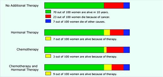
Bar graph format to communicate risk information. Bar graph format based on the decision support tool Adjuvant! Online to display estimated survival and mortality risks for breast cancer patients who are deciding between different adjuvant therapy options. Reproduced from Zikmund-Fisher et al. ( 51 ) with permission from John Wiley & Sons Inc.
Zikmund-Fisher et al. found that simpler presentations that focused on this binary choice ( 50 , 51 ) and showed only survival information ( 49 ) (an example is shown in Figure 3 ) resulted in improved understanding and greater sensitivity to the magnitude of risk reduction. We believe that this line of research provides compelling early evidence that health educators and clinicians need to tightly focus their communications by either deciding a priori what information is most essential for patients to make an informed decision or by exploring preferences with patients so that the choice set can be simplified.
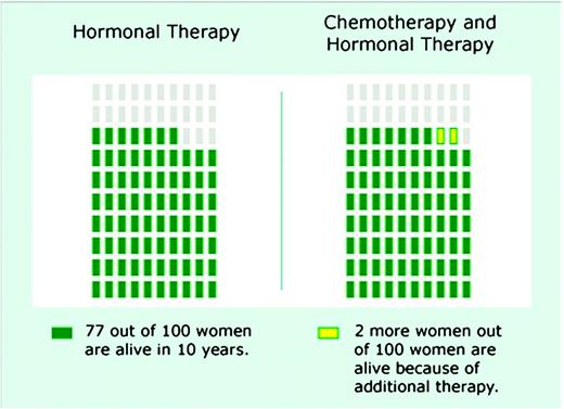
Binary choice pictograph format to communicate risk information. Binary format showing the incremental survival benefit to a breast cancer patient of adding chemotherapy to hormonal therapy. Each rectangle represents 1 out of 100 individuals. Reproduced from Zikmund-Fisher et al. ( 49 ) with permission from the authors.
Recommendation 10: Repeatedly Reinforce the Time Interval Over Which a Risk Occurs
As important as it is to simplify risk communications to facilitate comprehension, there is one detail that needs to be repeatedly reinforced in risk communications, the time interval during which the risk occurs. A risk is defined as the ratio of events observed to the total population size during a certain period. Unfortunately, patients (and likely clinicians) can easily ignore the time element of a risk and simply focus on the magnitude of the ratio. As a result, a patient who learns that he has a 17% lifetime risk of prostate cancer tends to have an intuitive “gist” that the risk is larger, and hence more concerning, than if he is presented with a 5% 10-year risk of prostate cancer.
Presenting risks using visual displays does not solve this problem, because most visuals draw patients’ attention to the risk ratio and do not visually show time at all. Even pictographs, our recommended risk graphic format (see “Recommendation 3”), relegate time details to easy-to-miss textual legends. Also, graphs that plot risk over time, such as survival curves, are not immune to this effect. In a pair of studies ( 53 , 54 ), we showed that people tend to perceive a treatment to be more effective when its risk reduction is shown in a 15-year survival curve graphic instead of a 5-year curve.
Because inattention to time appears to be a robust phenomenon, we urge cancer risk communicators to always describe the relevant time intervals clearly. In fact, when risks are constant over time, communicators can consider presenting the same risk at different time intervals (eg, this is your 5-year risk, your 10-year risk, and your 20-year risk), which may help to draw patient attention to how risk accumulates over time.
Conclusions
In this commentary, we have provided evidence-based recommendations for communicating information to patients either in written or spoken form. Our commentary is limited in that it is not a systematic review of the relevant literature. Instead, we have chosen to focus both on some of the most commonly agreed recommendations (eg, absolute vs relative risks, use of pictographs) and some newer more novel approaches to risk communication. However, others might have chosen other factors to describe.
We believe that it is the responsibility of all cancer educators, decision aid developers, and clinicians to be familiar with the growing body of rigorous research that has tested effective methods of presenting probabilistic information, so that patients can use it to make an informed decision. We hope that our illustrative review of the empiric evidence on how probabilistic information can best be presented to patients will motivate widespread use of these techniques, thereby improving the decision making experience of cancer patients.
Funding
National Institutes for Health (P50 CA101451 to PAU and AF; R01 CA87595 to PAU).
References
All authors participated in the interpretation of the data and writing of the article. All authors read and approved the final article.

